deliverable
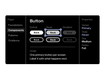
Design system
Your brand and interface, turned into a system
FeedsEngineering
Building the system behind the design
We turn your brand and interface into shared parts: tokens for colour, type and spacing, a set of components, and patterns for common tasks. Your designers and developers then build each new screen from the same source.
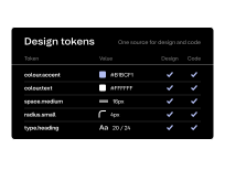
Tokens are the named values for colour, type, spacing and motion. Components are the buttons, form fields, cards, navigation and page sections that screens are made from. Patterns show how components combine for common tasks, such as a search page or a sign-up form. Each one comes with guidance on when to use it.
The work produces two things: a documented design system, and a coded component library.
We start from your brand and the screens you already have, and list the parts that repeat. We define the tokens first, then the components and patterns.
Designers and developers work on the same components at the same time, so the design system and the component library match. It often runs alongside UI design, as repeated elements appear.
Your brand and interface, turned into a system
FeedsEngineering
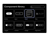
Reusable, coded building blocks for pages and features
FeedsEngineering
Tell us how many teams, sites and products your design needs to serve.