What's in it
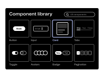
- A coded version of each component in your design system
- Documentation showing each component, its options and how to use it
- Accessibility and behaviour across screen sizes, built into each component
- On a Sanity website, the page sections your editors can add and arrange
How it's made
It comes out of design system development. Our front end developers build each component from the design system as it is designed, so the code matches the design.
Each component is tested across devices, browsers and assistive technology. On websites we usually build on Lucidity, our own enterprise Sanity starter kit.
How you use it
Your developers build pages and features from it, and a website or product build uses it from the first day of engineering. When a component changes, every page that uses it changes too.
Your editors get a set of page sections they can combine on their own, so a new landing page does not need a developer.